Featured Case

Storage Won but Access Lost

An analysis of how excessive wardrobe volume physically restricted movement and blocked natural light in a residential master bedroom.

Storage Won but Access Lost
2026-05-10 Evelyn Walker

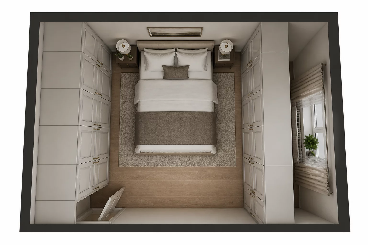
In the quest for maximum storage, homeowners often prioritize raw volume over the fundamental ergonomics of daily living. This specific case study focuses on a 180-square-foot master bedroom where the desire for a massive wardrobe resulted in a room that felt cramped and dysfunctional. The primary issue arose when floor-to-ceiling cabinetry was installed along the entire length of the only wall available for storage. While the resulting storage space was impressive, the physical footprint of the units severely encroached on the clearance needed around the king-size bed.

Structural choices dictate movement within a home. In this instance, the proximity of the wardrobe to the side of the bed reduced the walking path to a mere 14 inches. Such a narrow passage makes basic activities like changing the linens or accessing the far side of the bed physically taxing. Furthermore, the final cabinet unit extended directly into the window niche, obstructing nearly 30% of the natural light and preventing the casement window from opening fully. It is a classic example of winning the battle for organization while losing the war for comfort and spatial harmony.

Identification of Friction

The massive wardrobe units create an ergonomic bottleneck, reducing the walking path between the bed and storage to less than the recommended minimum. Additionally, the storage depth blocks the adjacent window frame, significantly reducing solar gain and ventilation.

Fixed Constraints

  • The 180-square-foot room had only one wall available for storage — the others had a window, a door, and a radiator
  • The king-size bed frame occupied a fixed 150cm x 200cm footprint that could not be reduced
  • The casement window required a full 90-degree opening clearance for ventilation and cleaning

Trade-offs

The kitchen redesign forced a direct confrontation between storage ambition and retrieval practicality. Every additional cabinet row added capacity but consumed clearance, and the household had to weigh bulk storage against the daily ease of reaching items by hand.

  • Cabinet volume vs. aisle clearance — upper cabinets doubled storage but narrowed the galley to 75cm
  • Counter depth vs. appliance fit — deeper counters accommodated the fridge but pushed the cooktop against the wall
  • Pantry height vs. reachability — tall pantries stored more but required a step stool for top shelves used daily

Rejected Option

A floor-to-ceiling pantry wall on the opposite side of the kitchen was considered as an alternative to deep perimeter cabinets. While it would have preserved aisle width, it consumed the only wall available for a second prep counter and eliminated the breakfast nook the household used every morning. The pantry wall also created a visual monolith that made the compact kitchen feel enclosed. The option was rejected because it sacrificed daily food-prep surface for storage that could be achieved with shallower cabinetry.

Analytical Feedback

Oscar

Oscar

Analyzer • 2026-05-08

Storage always wins for me. I would rather squeeze through a gap than have clutter in the room, although I see the point about the window.
Peggy

Peggy

Analyzer • 2026-05-09

But access is crucial! What is the point of having five wardrobes if you cannot even open the doors properly or see what is inside without natural light?

Contribute to Analysis