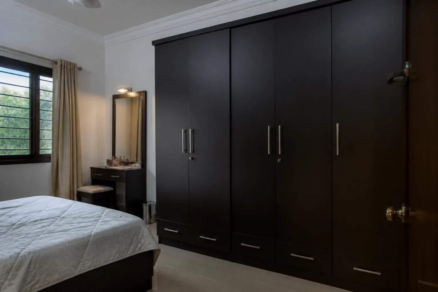
Standard bedroom layouts often prioritize maximum storage volume, assuming that more cubic space for clothes is always better. In this specific case involving a 12-square-meter room, the owners installed a floor-to-ceiling wardrobe in dark walnut along the only unobstructed wall. The result was an immediate and oppressive reduction in perceived space. The massive structure occupied a full wall opposite the door, essentially greeting every person entering with a visual dead end. It did not just store coats and seasonal garments; it swallowed the available light and redirected the natural flow of movement into an awkward, narrow channel beside the bed. What had been a modest but functional sleeping space became a storage corridor with a bed wedged into the remaining floor area.
The decision to install the wardrobe was driven by a practical need. The household had outgrown its existing closet space, and the bedroom offered the only wall long enough to accommodate a full run of cabinetry. The owners selected a 60cm-deep modular system in a rich walnut finish, believing that the darker tone would add warmth and sophistication to the room. In a larger space, this reasoning might have held. In a 12-square-meter bedroom with a single north-facing window, the effect was the opposite. The deep profile of the units protruded so far into the room that the walkway between the wardrobe and the bed edge was reduced to approximately 50 centimeters, barely enough for a person to pass sideways. The bed itself had to be pushed against the opposite wall, eliminating the possibility of access from both sides and making daily bed-making an acrobatic exercise.
The Psychology of Visual Crowding
The psychology of a small room depends heavily on sightlines and breathable corners. When a large, dark object blocks the furthest corner from the entry point, the brain registers the room as significantly smaller than its actual dimensions. This phenomenon, often called visual crowding, turns a place of rest into a place of claustrophobia. The dark walnut finish exacerbated the problem by absorbing rather than reflecting the limited natural light from the north-facing window. Even during midday hours, the room required artificial lighting to feel functional, creating a dependency on overhead fixtures that further emphasized the ceiling height and made the space feel like a box rather than a sanctuary.
The wardrobe also disrupted the room's primary axis. In a well-proportioned bedroom, the eye travels from the door to the window, registering a sense of depth and openness. The floor-to-ceiling unit intercepted this sightline, creating a visual wall that terminated the room prematurely. Instead of perceiving the full length of the space, anyone entering saw a monolithic block of dark wood that dominated the visual field. The bed, which should have been the room's focal point, was visually subordinated to the storage structure. This inversion of priorities—storage over rest, containment over comfort—is a common pattern in small bedrooms where storage anxiety overrides spatial logic.
Analyzing the Structural Bottleneck
We analyzed how the depth of the unit, combined with its high-contrast finish, created a structural bottleneck that could not be fixed by simply moving the bed. The conflict was not about the furniture itself, but about its relationship with the room's primary axis and its light source. The 60cm depth, standard for wardrobe modules, was appropriate for a walk-in closet or a dressing room but excessive for a bedroom where every centimeter of floor space mattered. A reduction to 40cm would have reclaimed 20 centimeters of walkway width, bringing the passage to a more manageable 70 centimeters and allowing normal walking movement rather than the sideways crab-walk that the current configuration demanded.
The finish of the wardrobe was equally problematic. Dark wood tones in small rooms absorb light and create a sense of visual weight that is disproportionate to the physical mass of the object. A lighter finish—white lacquer, ash, or even a warm neutral—would have reflected light back into the room and reduced the contrast between the wardrobe and the surrounding walls. The mirror sliding doors proposed in the solution would have served a dual purpose: reflecting the limited daylight deeper into the room and creating an illusion of additional space that partially counteracted the visual compression caused by the unit's presence.
Lessons for Small Bedroom Storage
This case illustrates a principle that applies broadly to small bedroom design: storage should be integrated into the architecture of the room, not imposed upon it. When a wardrobe dominates the visual and physical landscape of a bedroom, the room ceases to function as a place of rest and becomes a storage annex. The solution of replacing the deep, dark unit with a shallow, light-finish system with sliding mirrors addressed both the physical and psychological dimensions of the problem. By relocating the bulk of the storage to overhead cabinetry above the bed and reducing the depth of the main run, the room regained its primary function as a sleeping space while still providing adequate storage for the household's needs. The lesson is clear: in small rooms, the goal is not to maximize storage at all costs, but to balance storage capacity against the spatial and psychological requirements of rest.
This could be your first comment. Share your spatial logic below.